As an Amazon Associate KitchenwareSets.com earns from qualifying purchases.
Green Kitchen Walls Guide To The Perfect Timeless Shade
Struggling to find a kitchen wall color that feels both fresh and timeless? You’re not alone in wanting a change that won’t feel dated in just a few years.
This is where the design concept of green kitchen walls comes in. It’s a versatile color application that uses nature-inspired hues to transform a kitchen’s character. The biggest challenge is choosing the perfect shade that complements your existing space.
The perfect green for your kitchen walls is a shade that harmonizes with your room’s natural light and existing cabinet colors. This guide gives you a professional framework to select a timeless green, from muted sage to moody forest, ensuring a beautiful result that lasts.
Why Green Kitchen Walls Are The Ultimate Timeless Design Choice
Timeless Green Kitchen Walls: Green kitchen walls are considered a timeless design choice due to the color’s strong connection to nature and tranquility. When using muted shades like sage or olive, green acts as a sophisticated neutral that pairs well with both modern and classic fixed elements, ensuring design longevity.
Green’s enduring appeal isn’t a new trend; it’s rooted in color psychology. The color is psychologically linked to reduced stress and enhanced focus, making it a perfect choice for the heart of the home. Its prevalence in nature makes it feel familiar and calming. According to general expert consensus, muted, earth-toned greens resist dating far more effectively than highly saturated shades. This versatility allows shades like sage, moss, and olive to act as sophisticated neutrals that won’t go out of style, providing a beautiful backdrop that evolves with your taste.
The Green Shade Selection Framework: Light, LRV, and Undertones
Choosing the right green is less about trends and more about science. To find the perfect shade for your specific kitchen, you need a structured approach. What most guides miss is a clear decision framework. This professional methodology is based on three critical factors: your kitchen’s unique light, the undertones of your fixed elements, and a technical value called LRV.
- Analyze Your Lighting: The direction your kitchen windows face dramatically alters how color appears. North-facing rooms receive cool, blue-toned light all day, which can make some greens feel cold. To counteract this, you need warm, yellow-based greens like Olive or Moss. Conversely, south-facing rooms get bright, warm light and can easily handle cool, blue-based greens like Emerald or Seafoam without them feeling sterile.
-
Determine Your Light Reflective Value (LRV): LRV is a measurement from 0 (black) to 100 (white) that indicates how much light a color reflects. For small, dark kitchens, choose a green with an LRV above 50 to maximize light reflection and make the space feel bigger and brighter. Shades with an LRV below 20, like deep forest green, should only be used for a dramatic, moody aesthetic in well-lit spaces to avoid a cave-like effect.
-
Check Your Existing Undertones: Look closely at your cabinets, countertops, and flooring. Do they have warm (yellow, beige, orange) or cool (blue, grey, pure white) undertones? The key to a harmonious design is matching temperatures. Warm greens with yellow undertones pair seamlessly with natural wood and beige countertops. Cool greens with blue undertones are the perfect complement for cool-toned white cabinets, grey quartz, and marble surfaces.
9 Perfect Green Kitchen Walls Ideas, Styles, and Pairings
Here are nine actionable ideas, categorized by shade and style, to help you visualize and implement the perfect green kitchen walls. Each concept is based on successful design principles and real-world application.
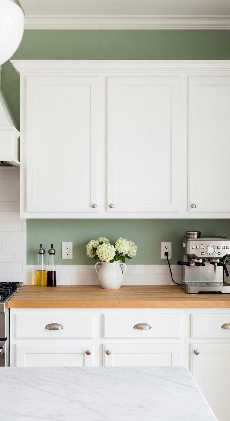
1. Muted Sage Green Walls for Timeless Neutrality
Pin this genius tips to your ‘Dream Kitchen’ board!
Sage green is the ultimate safe choice for a reason. Its significant grey undertone allows it to function as a sophisticated neutral, providing a soft wash of color that feels both organic and classic. It’s the perfect partner for crisp white shaker cabinets, creating an airy and timeless kitchen style.
Materials Needed:
- High-quality, washable Sage Green paint (consider specific designer-approved shades)
- Eggshell or Semi-Gloss finish (recommended for kitchen durability)
- High-quality painter’s tape (essential for clean lines against white trim)
- Paint rollers and brushes (use synthetic bristles for water-based paint)
Step-by-Step Directions:
- Wall Prep: Clean walls thoroughly to remove grease/steam residue; apply spackle to any imperfections, sanding smooth.
- Prime: Apply one coat of primer, particularly if the previous color was dark, to ensure true color payoff.
- Tape Edges: Use painter’s tape to mask all adjacent surfaces (cabinets, ceiling, trim) firmly.
- First Coat: Apply the first coat of Sage Green using a high-density roller, cutting in edges first with a brush.
- Second Coat & Peel: Allow minimum 4 hours to dry. Apply a second coat. Carefully peel the painter’s tape immediately after the second coat is finished while the paint is still wet to avoid chipping the edges.
- Pro-Tip: If pairing sage green walls with white cabinets, choose a white with a slightly warm undertone to prevent the final look from feeling sterile or clinical.
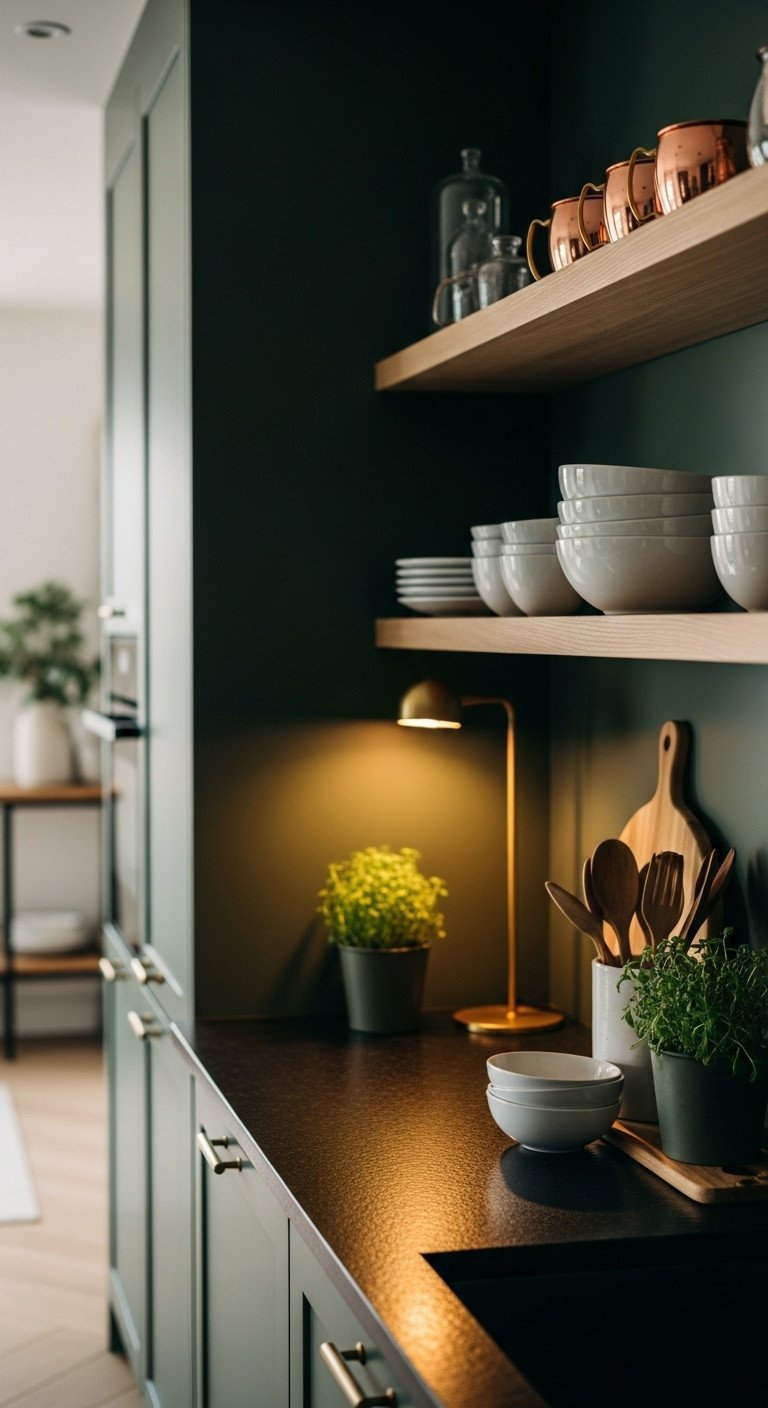
2. Achieving the Moody Aesthetic with Deep Forest Green
Save this clever organization idea!
For a dramatic, high-end look, a deep forest or hunter green is unmatched. This moody green kitchen aesthetic creates a cozy, enveloping feel. The key to success with a dark green hue is balancing its low LRV with strategic lighting and high-contrast elements like natural wood shelves and warm copper accents.
Materials Needed:
- Deep Forest Green or Hunter Green paint (ensure low LRV below 20)
- Semi-Gloss finish (essential for reflecting light back into the dark space)
- High-quality under-cabinet LED lighting (warm 3000K temperature recommended)
- Gray-toned primer (critical for achieving true dark color saturation)
Step-by-Step Directions:
- Primer Application: Apply the gray-toned primer. This is vital for dark shades to reduce the number of color coats needed and ensure depth.
- First Color Coat: Apply the first coat of dark green. Allow for full, manufacturer-recommended drying time (often 4-6 hours).
- Lighting Integration: Install warm LED strip lighting under all upper cabinets and open shelving to provide ambient and task light, counteracting the darkness.
- High-Contrast Trim: Use a crisp, bright white paint (or high-gloss black) on all trim and baseboards to sharply define the wall and prevent the dark shade from bleeding into adjacent architectural elements.
- Pro-Tip: Dark green works exceptionally well behind open shelving. The contrast allows your carefully curated dishes and accessories to pop visually, maximizing the aesthetic return on the deep shade.
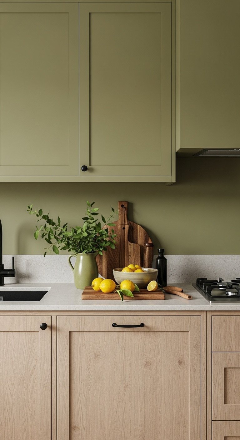
3. Pairing Earthy Olive Green with Natural Wood Cabinets
Pin this color coordination secret now!
If your kitchen features natural wood cabinets, an earthy olive green is your best friend. This warm green kitchen look capitalizes on olive green’s yellow and brown undertones, which create a harmonious and organic connection with the wood grain. Ground the look with matte black hardware for a touch of modern, industrial contrast.
Materials Needed:
- Warm, Moss or Olive Green paint (ensure the undertone is yellow/brown, not blue)
- Quality paint brushes (for precise application around cabinet borders)
- Sample cans of 3-4 different olive shades
- Matte Black cabinet hardware (pulls and knobs)
Step-by-Step Directions:
- Identify Wood Tone: Before buying full cans, hold paint swatches directly against your wood cabinets. The goal is to find an olive green whose warmth complements, but does not blend into, the wood’s tone.
- Sheen Choice: Choose a durable Eggshell or Flat sheen for the walls. This non-reflective finish provides a velvety, earthy texture that anchors the natural wood elements.
- Hardware Selection: Opt for matte black or dark bronze hardware, which offers a sophisticated, industrial contrast to both the warm wood and the organic olive green.
- Accessorize Organically: Reinforce the natural aesthetic by styling with terracotta pots, woven baskets, and linen textures. Avoid chrome or bright, cool metallics.
- Lesson Learned: A common mistake is using a cool, blue-based green with orange-toned oak cabinets, which creates an unpleasant clash. Always use warm olive or moss green with warm woods.
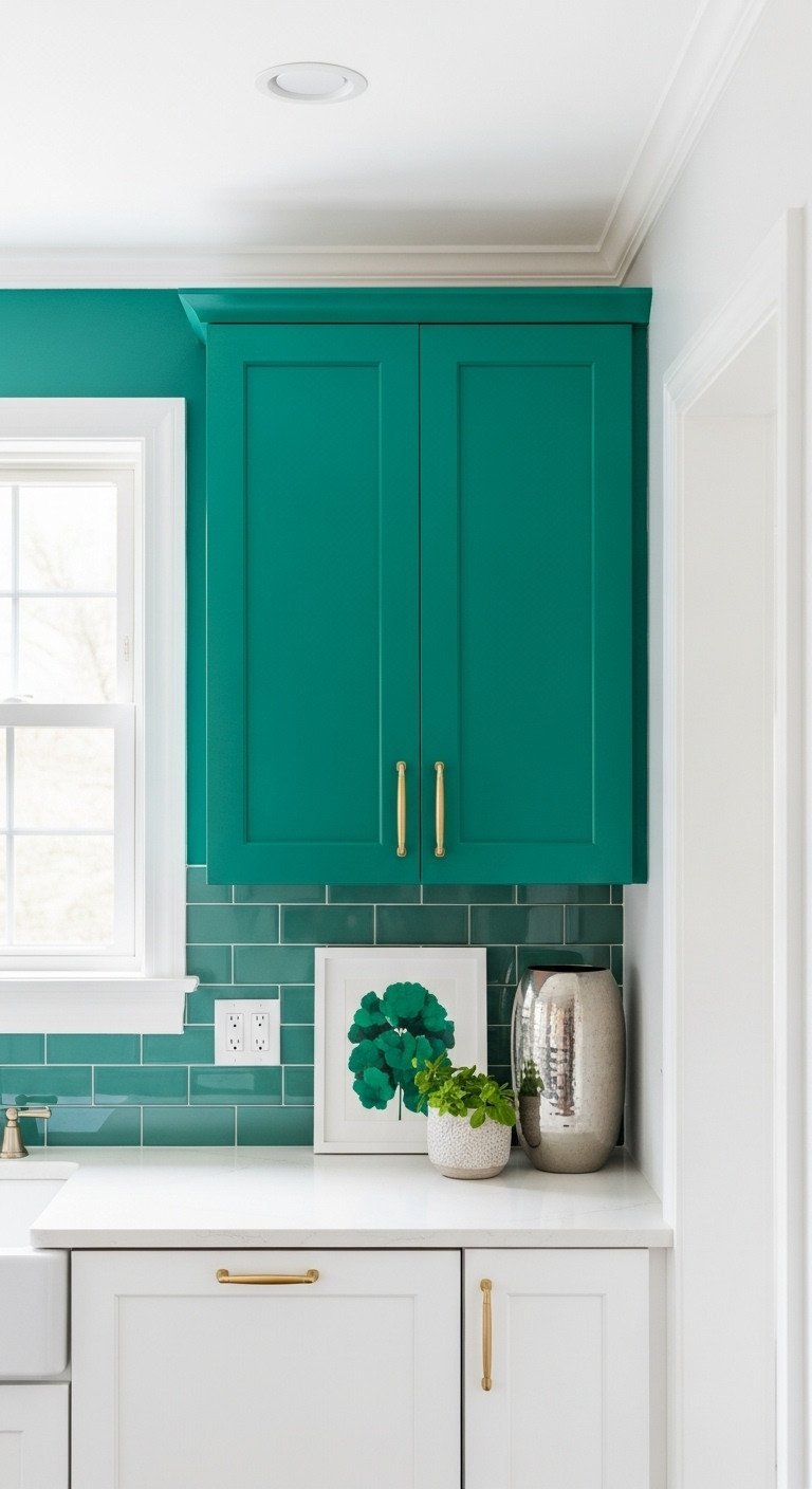
4. Creating a High-Contrast Green Accent Wall in Small Kitchens
Pin this small space solution!
You can absolutely use bold green in a small kitchen without making it feel cramped. The secret is to create a single, high-impact accent wall. By painting one wall in a vibrant emerald green and keeping the surrounding walls and trim a crisp white, you create an illusion of depth that can actually make the space feel bigger.
Materials Needed:
- Bold Emerald or Jewel-Toned Green paint (small quantity needed)
- High-contrast white trim paint (Semi-Gloss)
- Extra-wide painter’s tape (for the long vertical lines)
- High-LRV ceiling paint (to reflect maximum light downward)
Step-by-Step Directions:
- Select Focal Point: Identify the wall with the least amount of cabinetry or the wall visible from the adjacent living area. This will be the only green wall.
- Prep & Prime: Prepare the focal wall surface meticulously and apply primer. Use the primer on the accent wall only.
- Define Edges: Apply high-quality painter’s tape along the ceiling, baseboard, and adjacent walls. Ensure the tape is pressed down firmly.
- Two Coats: Apply two coats of the Emerald Green paint, peeling the tape immediately after the second coat while wet. Keeping the remaining walls bright white maximizes light bounce and exaggerates the depth of the green accent wall.
- Pro-Tip: If using a deep, saturated color like Emerald Green, ensure all surrounding walls, ceiling, and trim are painted in a high-LRV, cool white to visually push the non-green areas back, making the small space feel less confined.
5. Integrating a Durable Green Tile Backsplash for Texture
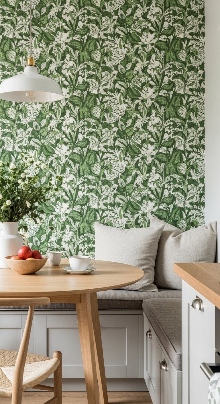
Save this durable design inspiration!
For high-splash zones behind sinks and stoves, a green tile backsplash offers superior durability compared to paint. Using a rich green subway or zellige tile introduces not just color but also texture and a light-reflective quality. It’s a practical and beautiful way to create a feature wall that stands up to the demands of a working kitchen.
Materials Needed:
- Green ceramic or zellige subway tile (quantity based on square footage)
- Tile adhesive (mastic) and trowel
- Grout (light grey or white recommended for contrast)
- Sealant (must be kitchen/bath appropriate)
- Wet saw or tile cutter
Step-by-Step Directions:
- Surface Prep: Ensure the wall surface is clean, flat, and structurally sound. Mark a center vertical line to begin laying the tile symmetrically.
- Adhesive Application: Use the trowel to spread adhesive onto the wall in small sections, using the notched side to create uniform grooves.
- Tile Setting: Begin setting the green tiles, using spacers to ensure uniform grout lines. Cut tiles as needed, especially around outlets and window frames.
- Grouting & Sealing: Once the adhesive is cured (usually 24 hours), mix and apply the grout, wiping away excess with a damp sponge. After the grout cures, apply a quality tile and grout sealant for maximum moisture protection and durability.
- Pro-Tip: If using a deep green tile, pair it with a light grey or white grout to make the individual tile shapes pop, adding visual texture. This is especially effective when working with handmade-look tiles like zellige.
6. Layering Texture with Botanical Green Wallpaper
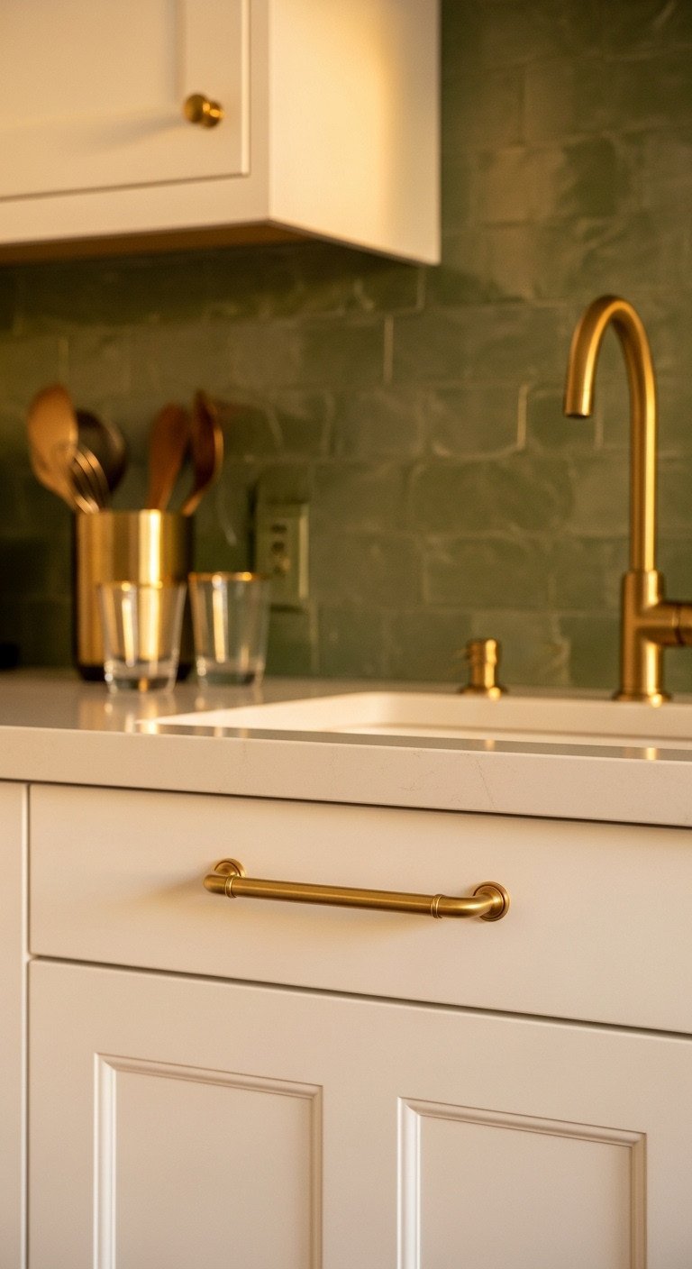
Try this high-impact, low-commitment refresh!
If you crave a bold pattern or are hesitant to commit to paint, botanical green wallpaper is a fantastic solution. Modern peel-and-stick options make this a low-commitment, DIY-friendly project perfect for renters or for adding a maximalist touch to a breakfast nook, pantry, or accent area.
Materials Needed:
- Peel-and-stick botanical green wallpaper (quantity based on wall size)
- Smoother tool (wallpaper brush or plastic squeegee)
- Utility knife and metal straightedge
- Measuring tape and step stool
Step-by-Step Directions:
- Measure & Cut: Measure the wall accurately, accounting for pattern repeat. Cut wallpaper strips slightly longer than needed.
- Position First Strip: Peel back the backing 12 inches and align the first strip perfectly straight using a level. This strip dictates the success of the entire installation.
- Smooth & Adhere: Peel the backing down gradually, pressing the wallpaper firmly to the wall and using the smoother tool to eliminate air bubbles as you go.
- Match & Trim: Align the pattern on subsequent strips carefully. Once all strips are adhered, use the utility knife and straightedge to trim excess material at the baseboard and ceiling.
- Lesson Learned: Avoid placing patterned wallpaper directly behind the stove or sink, as steam and grease can degrade the adhesive and fabric faster than durable paint or tile. Stick to low-splash zones like dining nooks or pantry interiors.
7. Coordinating Green Walls with Warm Brass Accents
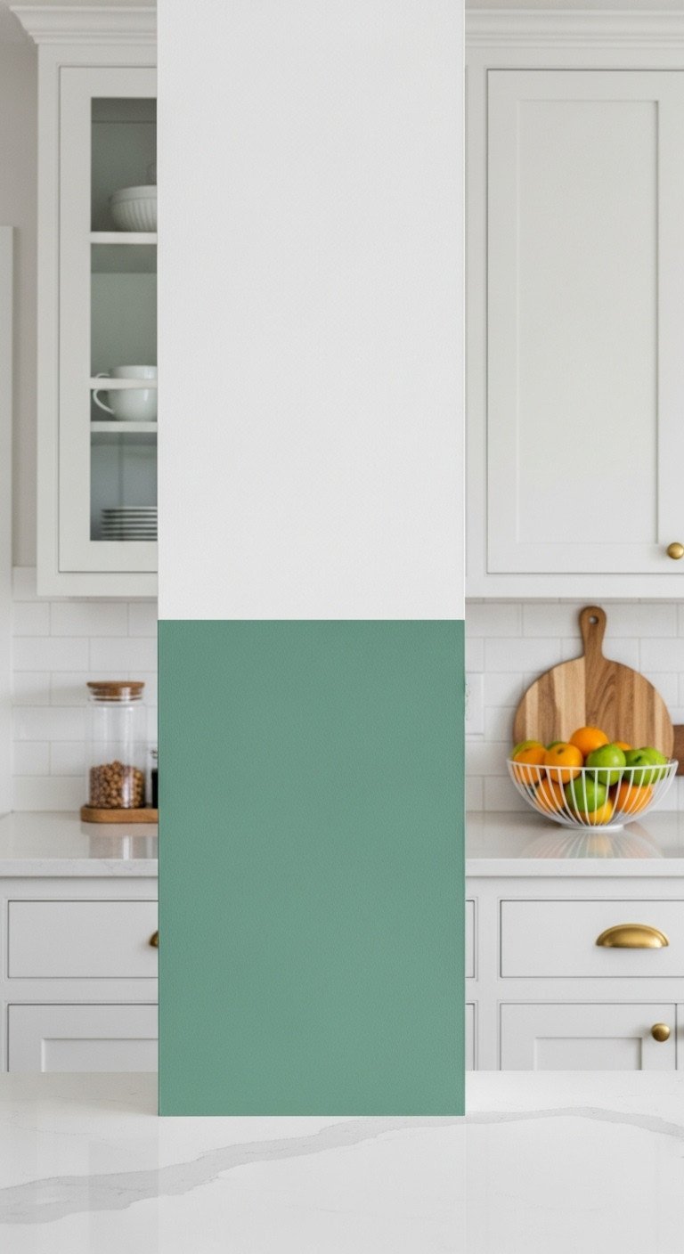
Save this hardware pairing guide!
The right metallic fixtures can elevate your green kitchen from nice to stunning. For warm-toned green walls like olive, moss, or fern, brushed brass hardware is the perfect complement. The warm, reflective quality of the brass amplifies the earthy tones in the paint, creating a cohesive and sophisticated look.
Materials Needed:
- Brushed or unlacquered Brass cabinet pulls and knobs
- Matching Brass faucet or pot filler
- Warm-toned Green paint (Olive, Moss, or Fern)
- Drill and measuring template (for new hardware installation)
Step-by-Step Directions:
- Determine Green Temperature: Ensure your chosen green paint has a warm (yellow/brown) undertone. Brass and gold are warm metals and will clash with cool, blue-based greens like emerald or seafoam.
- Consistency is Key: Use the same metallic finish (e.g., brushed brass) for all kitchen metals: cabinet pulls, faucet, pendant light fixture frames, and even small accessories.
- Install Hardware: Mark the cabinet door/drawer carefully using a template, then drill the holes and secure the brass hardware firmly.
- Accessorize: Reinforce the warmth by incorporating other natural, reflective elements like gold-framed art, wooden bowls, or small copper items on open shelving.
- Expert Insight: Brass and gold accents are essential when working with deep, moody greens, as the reflection of the warm metal breaks up the heavy color and prevents the space from feeling too dense or cold.
8. Maximizing Light with Bright Mint Green Walls
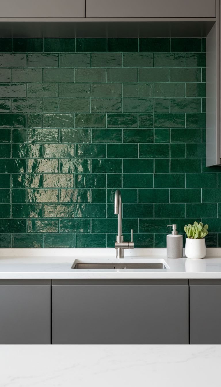
Pin this light-enhancing color tips!
For small or dark kitchens that need a brightness boost, a pale mint or pistachio green is a brilliant solution. These light green shades have a high LRV (over 60), meaning they reflect a significant amount of light back into the room. This airy green shade creates a fresh, clean, and uplifting atmosphere, perfect for a coastal-inspired style.
Materials Needed:
- Pale Mint or Pistachio Green paint (LRV of 60 or higher)
- Semi-gloss finish (to maximize light reflection)
- Cool-toned white cabinet paint (if cabinets are also being updated)
- High-CRI (Color Rendering Index) LED light bulbs
Step-by-Step Directions:
- Calculate LRV: Confirm the chosen light green shade has a high LRV (Light Reflective Value) to ensure it performs well in low light conditions.
- Use Semi-Gloss: Unlike dark greens which can handle Eggshell, use a Semi-Gloss finish for pale greens in small kitchens. The slight shine helps bounce both natural and artificial light around the space, increasing perceived brightness.
- Pairing: Use crisp, cool white for the ceiling and trim. Avoid beige or cream neutrals, as they will pull the color warmer, dulling the clean mint effect.
- Lighting Upgrade: Swap existing light bulbs for high-CRI, cool-toned (4000K-5000K) LED bulbs to ensure the light source is neutral and does not introduce a yellow cast that could distort the delicate mint hue.
- Pro-Tip: Mint green with a blue undertone is highly effective for creating a coastal or serene aesthetic. Pair it with brushed nickel or chrome hardware for a clean, modern finish.
9. Designing a Monochromatic Green and White Two-Tone Wall

Pin this sophisticated technique to your renovation board!
For an advanced, architectural look, consider a two-tone wall treatment. Painting the lower third of the wall in a mid-tone green (like seafoam or a medium sage) and the upper two-thirds in crisp white creates visual hierarchy and adds depth. This technique is especially effective for making ceilings feel higher.
Materials Needed:
- Mid-tone Green paint (e.g., Seafoam or medium Sage)
- Crisp White paint (for the upper wall section)
- Laser level (essential for a perfectly straight line)
- Wide painter’s tape (or a thin wooden trim piece for separation)
Step-by-Step Directions:
- Determine Division Line: Use a laser level to mark a perfectly horizontal line around the room. For standard ceilings, marking the line one-third up from the floor (approx. 34-36 inches) works best, or align with the bottom of the upper cabinets.
- Paint Upper Section: Paint the entire upper section (from the line to the ceiling) in your chosen crisp white. This provides a clean canvas and makes subsequent steps easier.
- Tape and Secure: Apply wide painter’s tape exactly along the level line (or install a decorative trim piece). Secure the tape firmly.
- Apply Green: Apply two coats of the mid-tone green to the lower portion of the wall. Peel the tape immediately upon completing the second coat to achieve a flawlessly sharp dividing line, creating a sophisticated color-blocked effect.
- Pro-Tip: Painting the upper wall white draws the eye upward, effectively making the ceiling look taller. This technique is highly recommended for kitchens with lower ceilings or limited natural light.
Key Takeaways: Your Quick Guide to Green Kitchen Coordination
Here is a quick reference guide to help you remember the most important rules for selecting and pairing your perfect green.
| Shade Type | Recommended Pairing (Cabinets/Metals) | Best for Lighting | Timelessness Factor |
|---|---|---|---|
| Sage Green | Crisp White, Natural Wood, Matte Black Hardware | All Light Conditions | Highest (Acts as a neutral) |
| Olive Green | Warm Wood Tones (Oak, Walnut), Brass Hardware | North or East-Facing (Needs warmth) | High (Earthy and Muted) |
| Forest/Hunter Green | Bright White, Copper, Gold/Brass Hardware | Well-Lit Rooms (South/West) | Moderate/High (Based on classic library colors) |
| Mint/Pistachio | Cool White, Silver/Nickel Hardware | Small/Low-Light Rooms | Moderate (Can feel dated if too saturated) |
- Top 5 Rules for Green Kitchen Walls:
- Always Test Swatches: View swatches (at least 12″x12″) on your wall at different times of day to account for light shift.
- Match Temperature: Warm greens (olive) must be paired with warm elements (wood, brass). Cool greens (emerald) pair better with cool elements (grey, marble, chrome).
- Prioritize Durability: Use Eggshell or Semi-Gloss finish in high-humidity kitchen environments for scrubbability.
- Use High Contrast: When choosing a deep, dark green, use a high-contrast white on trim, ceiling, and baseboards to prevent the room from feeling closed in.
- Layer Lighting: Install layered lighting (overhead, pendant, under-cabinet) to ensure the green shade looks intentional, especially in moody, dark green kitchens.
People Also Ask About Green Kitchen Walls
What is the most timeless shade of green paint for a kitchen?
Sage green is widely considered the most timeless shade of green for a kitchen. Its high grey undertone mutes the color, allowing it to function almost as a sophisticated neutral. Sage green pairs beautifully with both traditional wood and modern white or grey cabinets, ensuring design longevity that will withstand changing trends for decades.
What color cabinets look best with dark green kitchen walls?
The best pairing for dark green kitchen walls is often bright, crisp white cabinetry. The stark contrast prevents the dark green from overwhelming the space and provides visual balance. Alternatively, natural light-toned wood cabinets (like maple or light oak) create a harmonious, earth-toned look that is increasingly popular in 2025.
Should I paint my kitchen walls or the cabinets green?
Painting the walls green is generally recommended as the lower-commitment option. Walls are cheaper, faster, and easier to repaint if tastes change or you want to update the shade. Painting the cabinets green is a higher-cost, high-commitment design choice, best suited for those absolutely certain of their long-term color preference.
Final Thoughts
The versatility of green kitchen walls ensures your space will feel beautiful, tranquil, and curated for years to come—provided you choose your shade intentionally. By analyzing your kitchen’s light and existing fixed elements against the Green Shade Selection Framework, you have all the expertise needed to move forward confidently. The perfect shade is waiting.
Which shade—Sage, Olive, or Forest Green—do you think best matches the natural light in your kitchen? Share your paint plan in the comments below
Last update on 2025-12-31 at 01:22 / Affiliate links / Images from Amazon Product Advertising API
