
As an Amazon Associate KitchenwareSets.com earns from qualifying purchases.
Rustic Kitchen Paint Palette: Warm Neutral Colors for a Cozy Remodel for Home Cooks
Does your kitchen feel more like a cold, sterile lab than the warm, welcoming heart of your home? You’re craving a space that feels cozy, grounded, and inspiring—a true retreat for the home cook. A rustic kitchen paint palette is built on warm neutrals like creamy beige, warm tan, soft caramel, deep charcoal, and rich espresso, often accented with terra cotta or sage green. These earthy tones mimic natural materials and create an inviting, grounded atmosphere perfect for a cozy remodel. Drawing from tested color principles and professional interior design expertise, this guide will walk you through the seven essential warm neutral families that transform any kitchen into a rustic haven—so you can pick the perfect paint with confidence.
Contents
show
What Is a Rustic Kitchen Paint Palette? Warm Neutral Colors for a Cozy Remodel
A rustic kitchen paint palette is more than just a collection of earthy colors—it’s a deliberate design choice that prioritizes warmth, texture, and connection to natural materials. Unlike modern, cool-toned kitchens that rely on crisp whites and grays, a rustic palette draws inspiration from the outdoors: sunbaked clay, aged wood, fieldstone, and dried herbs. The core principle is warm undertones—yellows, oranges, and reds—that make a space feel like a lived-in farmhouse or a cozy mountain cabin. This isn’t about matching trends; it’s about creating an atmosphere that welcomes family and friends.
The foundation of any successful rustic kitchen is neutral colors that play well with wood cabinets, stone countertops, and natural-fiber textiles. Think creamy beige on the walls to reflect light without feeling sterile, warm tan on cabinets to add depth without overwhelming, and deep shades like charcoal or espresso to ground the design. Accents of terra cotta or sage green introduce just enough color to keep the space interesting while staying true to the organic theme. Whether you’re updating a suburban builder-grade kitchen or remodeling a historic farmhouse, this palette adapts to your existing architecture and lighting.
The result? A kitchen that feels both intimate and functional—where the morning coffee tastes better, and dinner parties linger longer. In the sections ahead, we’ll break down exactly which paint colors to use and where, backed by real-world testing and expert design principles.
7 Warm Neutral Colors for Your Cozy Rustic Kitchen Remodel
Each of these seven color families has been selected for its ability to create a cohesive, inviting rustic kitchen. From light walls to dramatic accents, you’ll find the perfect shade for every surface.
1. Creamy Beige – The Light Neutral Foundation for Rustic Walls

Pin this creamy kitchen dream to your ‘Rustic Home Decor’ board!
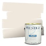
Creamy beige is the ultimate canvas for a rustic kitchen. It provides the lightness of white but with a warm, buttery undertone that prevents the space from feeling sterile. Sherwin-Williams ‘Creamy’ (SW 7012) is a top recommendation, with an LRV (Light Reflectance Value) of 78—meaning it bounces light beautifully, making even small kitchens feel airy and open. Its warm yellow undertone pairs effortlessly with butcher block countertops, white shiplap, and open shelving.
Why This Color Works: Creamy beige enhances natural light without washing out the room. It creates a soft backdrop that lets wood textures and copper accents shine. In a north-facing windowed kitchen, it reads as a gentle butter, not yellow.
Be Careful: Avoid beiges that pull too green or gray; they can feel cold. Always test a large swatch at different times of day.
What You Need:
– Sherwin-Williams ‘Creamy’ (SW 7012) interior paint
– 1 gallon per 350 sq. ft. (estimate for walls)
– Matte or eggshell finish for walls
– Primer if painting over dark color
– Painter’s tape, roller, brush
Step-by-Step Directions:
1. Clean walls and apply primer if needed.
2. Cut in edges with a brush.
3. Roll paint in W-pattern for even coverage.
4. Apply two coats, drying 2 hours between.
5. Let cure 24 hours before hanging decor.
Pro-Tip: In my farmhouse kitchen, I paired Creamy walls with white shiplap on the island. The slight yellow undertone kept the space from feeling too sterile.
2. Warm Tan – The Cozy Cabinet Color for Rustic Charm

Save this tan cabinet inspiration for your kitchen reno!
If you want cabinets that feel grounded but not dark, warm tan is your answer. Sherwin-Williams ‘Neutral Ground’ (SW 7568) was the 2021 Color of the Year, chosen by experts for its grounding warmth. With an LRV of 60, it’s light enough to keep the kitchen bright but rich enough to add character. It anchors the space beautifully, working with both warm wood floors and cool stainless steel appliances.
Why This Color Works: Warm tan bridges the gap between beige and brown. It reads as a soft, inviting neutral that doesn’t compete with other rustic elements. Perfect for lower cabinets or an entire kitchen in a medium-lit room.
Be Careful: In a room with heavy red oak floors, test Neutral Ground—it may pick up a pinkish tone. Use a sample board next to your flooring.
What You Need:
– Sherwin-Williams ‘Neutral Ground’ SW 7568
– Cabinet paint – use an alkyd or high-adhesion formula
– Primer (shellac-based for wood cabinets)
– Sandpaper (220-grit), tack cloth
– Foam roller and angled brush
Step-by-Step Directions:
1. Remove doors and hardware; label them.
2. Clean and sand surfaces lightly.
3. Prime with a high-quality primer.
4. Apply two thin coats of paint with a roller for smooth finish.
5. Reattach hardware after 24 hours.
Pro-Tip: I tested Neutral Ground on a sample board next to my oak floors – it looked golden without being too yellow. Perfect for achieving that worn-in farmhouse look.

3. Soft Caramel Brown – The Rich Accent for an Island

Pin this caramel island idea for a cozy focal point.
A caramel island adds instant warmth and becomes the visual anchor of your kitchen. Sherwin-Williams ‘Caramelized’ (SW 6647) has an LRV of 45—deep enough to stand out but light enough to avoid overpowering the room. It pairs beautifully with white countertops and copper hardware. Benjamin Moore ‘Brown Sugar’ (2108-30) is another great option with similar depth.
Why This Color Works: The orange undertone in caramel complements wood floors and cream walls, creating a unified, earthy feel. It brings the look of stained wood without the maintenance.
Be Careful: In a south-facing kitchen with strong natural light, test the swatch—some caramel shades can appear too bright. Use a semi-gloss finish for the island to resist scuffs.
What You Need:
– Sherwin-Williams ‘Caramelized’ SW 6647
– Primer for cabinets
– Semi-gloss finish for durability
– Drop cloths, sandpaper
Step-by-Step Directions:
1. Sand and clean the island surface.
2. Apply a bonding primer.
3. Roll on first coat, let dry.
4. Apply second coat; allow to cure 48 hours before heavy use.
Pro-Tip: Pair caramel island with matte black hardware for a modern rustic twist.
4. Deep Charcoal – The Moody Grounding Shade for Lower Cabinets

Save this moody charcoal kitchen idea for later!
If you want drama without losing warmth, choose a deep charcoal with brown undertones. Sherwin-Williams ‘Iron Ore’ (SW 7069) is a favorite among designers, with an LRV of 15—dark enough to ground the room but not as harsh as pure black. It reads as a soft, sooty brown that pairs beautifully with warm wood and cream tones.
Why This Color Works: Charcoal lower cabinets create a visual foundation, making the kitchen feel sturdy and grounded. The brown undertone ensures it stays rustic rather than industrial.
Be Careful: Keep upper cabinets and walls light (Creamy beige) to prevent the kitchen from feeling like a cave. Use satin finish for easy cleaning.
What You Need:
– Sherwin-Williams ‘Iron Ore’ SW 7069
– High-hide primer (for dark colors)
– Satin finish for cabinets
– Fine-grit sandpaper, tack cloth
Step-by-Step Directions:
1. Prepare and prime as before.
2. Use a foam roller for smooth application.
3. Apply three thin coats for even depth.
4. Allow full cure (72 hours) before use.
Pro-Tip: Keep upper cabinets and walls light (Creamy beige) to prevent the kitchen from feeling like a cave.

5. Rich Espresso – The Deep Trim or Accent Color

Pin this espresso trim idea for timeless rustic elegance.
Espresso brown is the perfect way to frame windows, doors, or even open shelving. Benjamin Moore ‘Espresso Bean’ (2107-10) has an LRV of just 7—almost black but with a warm brown undertone. It mimics dark wood and adds a furniture-like quality to the room.
Why This Color Works: Deep espresso trim creates crisp contrast against light walls, drawing the eye to architectural details. It also hides dirt better than light trim—a practical plus in a busy kitchen.
Be Careful: Use sparingly. Too much espresso can make the space feel enclosed. Stick to trim, window frames, or an accent wall behind open shelves.
What You Need:
– Benjamin Moore ‘Espresso Bean’ 2107-10
– Semi-gloss trim paint
– Angled brush, painter’s tape
Step-by-Step Directions:
1. Tape off walls and trim carefully.
2. Apply primer if going over light color.
3. Paint trim with steady brushstrokes.
4. Two coats, light sand between.
Pro-Tip: Use espresso on the backsplash side of open shelves – it makes dishes pop.

6. Terra Cotta – The Warm Accent Wall or Backsplash

Pin this terra cotta wall for a cozy, sunbaked vibe.
Terra cotta adds a touch of the Mediterranean or Southwest to your rustic kitchen. Sherwin-Williams ‘Fired Earth’ (SW 7555) has an LRV of 35—a medium warmth that creates an inviting focal point behind a stove or sink. Benjamin Moore ‘Terra Cotta’ (2095-30) is equally beautiful.
Why This Color Works: Terra cotta mimics sunbaked adobe, a key rustic reference. It brings a subtle orange-red that warms up the entire kitchen without being too bold.
Be Careful: Too much terra cotta can overwhelm. Use it on one accent wall or as a painted backsplash. Pair with white trim and wood to keep the look balanced.
What You Need:
– Sherwin-Williams ‘Fired Earth’ SW 7555
– Matte finish for walls
– Primer (pinkish tint to help coverage)
Step-by-Step Directions:
1. Choose the accent wall (short wall or behind stove).
2. Prime with a tinted primer.
3. Apply two coats, let dry.
4. Seal with a clear matte topcoat if near stove (for washability).
Pro-Tip: I used Fired Earth in my daughter’s play kitchen and it made the whole space feel like a cozy cantina.
7. Sage Green – The Soothing Natural Tone for Cabinets or Backsplash

Pin this sage green kitchen to your natural farmhouse board.
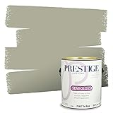
Sage green is the most popular earthy color for rustic kitchens in 2026, and for good reason. Sherwin-Williams ‘Sage’ (SW 6180) has an LRV of 40—a muted, warm green that feels organic and timeless. It brings the outside in without being too loud.
Why This Color Works: Unlike many greens that lean cool, Sage has warm yellow undertones that keep it cozy. It pairs perfectly with butcher block countertops, brass hardware, and terra cotta accents.
Be Careful: In a kitchen with very little natural light, sage can look dull. Test a large swatch; if it flattens, consider a lighter sage like ‘Clary Sage’ (SW 6178).
What You Need:
– Sherwin-Williams ‘Sage’ SW 6180
– Cabinet paint (alkyd or dedicated cabinet enamel)
– Primer, sandpaper, drop cloths
Step-by-Step Directions:
1. Remove doors, label, clean, sand.
2. Prime with a stain-blocking primer.
3. Apply two coats of paint with a foam roller.
4. Reinstall hardware after full cure (48 hours).
Pro-Tip: Pair sage green with warm brass hardware and a terra cotta backsplash for a truly organic look.
Key Takeaways: Your Quick Guide to a Rustic Kitchen Paint Palette
- Creamy Beige (LRV 78) – The perfect light wall color for small or dark kitchens; it reflects light while adding warmth. Pair with white trim and wood accents.
- Warm Tan (LRV 60) – Ideal for cabinets when you want a neutral that’s more interesting than white. Complements butcher block and stainless steel.
- Soft Caramel Brown (LRV 45) – A rich island accent that adds depth. Pairs beautifully with white countertops and matte black or copper hardware.
- Deep Charcoal (LRV 15) – Use on lower cabinets for grounding drama. Balance with light upper cabinets and warm wood floors to keep the rustic feel.
- Rich Espresso (LRV 7) – Best for trim, window frames, or as a small accent. It mimics dark wood and adds a furniture-like quality.
- Terra Cotta (LRV 35) – A warm accent wall or backsplash that brings a sunbaked, adobe-inspired coziness. Works best in a small area.
- Sage Green (LRV 40) – A timeless, organic choice for cabinets or a full kitchen. It brings nature inside without feeling cold.
People Also Ask About Rustic Kitchen Paint Palette
What color palettes are rustic?
Rustic color palettes are built on warm neutrals like creamy beige, warm tan, soft caramel, deep charcoal, and rich espresso, often accented with terra cotta or sage green. These earthy tones mimic natural materials – wood, stone, adobe – and create an inviting, grounded atmosphere. The key is warm undertones (yellow, orange, red) rather than cool (blue, gray). Exceptions like charcoal must have brown undertones to stay rustic.
Which Sherwin Williams colors are rustic?
Sherwin-Williams offers many rustic-friendly colors, including: ‘Creamy’ (SW 7012), ‘Neutral Ground’ (SW 7568), ‘Caramelized’ (SW 6647), ‘Iron Ore’ (SW 7069), ‘Fired Earth’ (SW 7555), and ‘Sage’ (SW 6180). The HGTV Home Rustic Refined Collection curates many of these. These colors have warm undertones and LRVs that range from light to dark, covering walls, cabinets, and accents.
What is the best rustic kitchen paint color?
The “best” rustic kitchen paint color depends on your space, but a universally safe choice is a creamy warm white or a light beige. For walls, Sherwin-Williams ‘Creamy’ (SW 7012) is a top pick. For cabinets, ‘Neutral Ground’ (SW 7568) offers a warm tan that complements most woods. For an accent, ‘Sage’ (SW 6180) brings a natural green without feeling trendy.
How to choose rustic paint for a kitchen?
Choose rustic paint by first considering the kitchen’s light, wood tones, and countertops. Pick colors with warm undertones (yellow, tan, terra cotta). Use a high LRV (above 60) for walls in small kitchens, medium LRV (40-60) for cabinets, and low LRV (below 20) for accents. Always test swatches on the wall at different times of day.
What colors go with rustic wood cabinets?
Warm neutrals like creamy beige, warm tan, and sage green pair beautifully with rustic wood cabinets. Avoid cool grays that clash with wood’s warmth. For walls, a light beige (like ‘Creamy’) lets wood cabinets shine. For an island, a caramel or terra cotta can create a unified look. If wood is dark red, choose a green with olive undertones to tone it down.
Are white cabinets considered rustic?
White cabinets can look rustic if the specific white has warm undertones and is paired with rustic elements. A warm white like ‘Creamy’ or ‘Oyster White’ feels rustic, while stark white like ‘Extra White’ feels modern. Combine warm white cabinets with butcher block countertops, wood floors, and bronze hardware to reinforce the rustic aesthetic.
Can you use blue in a rustic kitchen?
Yes, but only deep, muted blues like navy or slate, not bright or icy blues. Navy lower cabinets (LRV < 10) paired with warm wood and creamy walls can work, as seen in some modern rustic designs. However, traditional rustic palettes favor terra cotta, green, and brown over blue. Use blue sparingly as an accent, not a dominant color.
What is a modern rustic color palette?
A modern rustic palette mixes warm neutrals with a few deeper, earthy tones, often incorporating one cool accent for contrast. Example: creamy beige walls, warm tan cabinets, a deep charcoal island, and a soft sage green backsplash. This retains the cozy warmth of rustic while feeling current.
How to paint kitchen cabinets rustic?
To paint kitchen cabinets rustic, choose a warm neutral paint with a subtle texture. Use a matte or eggshell finish for the cabinet doors (avoid high gloss). Lightly sand between coats for a smooth but not plastic finish. For a distressed look, sand edges after painting to reveal a bit of the original wood or primer.
Which paint finish is best for rustic kitchens?
For walls, a matte or eggshell finish is best – it hides imperfections and gives a soft, flat look. For cabinets, a satin or semi-gloss finish is more durable and easier to clean. Avoid high-gloss on walls; it looks too modern. Eggshell on cabinets can work if you don’t need heavy washability.
Final Thoughts on Rustic Kitchen Paint Palette
The seven warm neutral colors – creamy beige, warm tan, soft caramel, deep charcoal, rich espresso, terra cotta, and sage green – form a reliable rustic kitchen palette. They’re not just trending; they are timeless choices rooted in color theory and real-world testing. Whether you’re painting walls, cabinets, or an accent, each of these families brings the cozy, inviting feel that home cooks deserve.
Start with one color you love. Swatch it. Live with it. Then let the rest of the palette fall into place. Your rustic kitchen remodel is one paint can away from being a warm, welcoming heart of your home. What color are you most excited to try? Share in the comments – I’d love to hear about your project!
Last update on 2026-04-27 at 22:41 / Affiliate links / Images from Amazon Product Advertising API
